Styleguide – The Visual Concept of NFDI4Biodiversity
You would like to create presentation slides, posters or other materials in the NFDI4Biodiversity design?
Our style guide helps with the correct use of our logo, font and project colours.
Purpose of the Styleguide
Biodiversity, ecology and environmental data from various sources – such as scientific institutions and IT service centres, museums, natural history societies and state offices – hold immense potential for the conservation of threatened biodiversity. In NFDI4Biodiversity, around 50 partners from all these areas are therefore pooling their scientific and technical expertise to make this data easier to find, accessible, interoperable and reusable.
The common goal is to develop a digital infrastructure – the so-called Research Data Commons – that enables users to access a comprehensive stock of biodiversity and environmental data, to submit data themselves and to apply methods and tools for archiving, publishing, searching and analysing data that are suitable for everyday use and have been tested in practice. These services are provided by the partner institutions.
In order to provide our partners, but also other NFDI consortia with whom we regularly cooperate, with orientation for the creation of project materials of all kinds, this style guide has been developed to help use the consortium's essential design elements – logo, colours and font – correctly.
Are you missing information or do you have questions? Send us a message via our contact form.
Key messages and target groups
About NFDI4Biodiversity
Our Mission Statement, developed in 2021, explains who we are, what we do and the value we aim to deliver.
Target groups
Our persona method helps to communicate accordingly to NFDI4Biodiversity's diverse community and, therefore, target groups with their specific levels of knowledge and interests, such as nature enthusiasts and volunteers, early and mid-career researchers, senior researchers and professional data managers.
Logo
Logo files
The logo can be downloaded here: www.nfdi4biodiversity.org/en/downloads
Guidelines for Use
The NFDI4Biodiversity logo consists of an icon and lettering. It may not be altered in any way and is to be placed free-standing and horizontally in front of a neutral, calm background. To ensure sufficient contrast, the logo with a colored icon should only be used on a white or almost light background and on a black or similarly dark background. For colored backgrounds, the logo with white or black icon should be used. Here, too, care must be taken to ensure sufficient contrast.
Margin and minimum size
When using the logo, make sure to keep a certain margin, called the protection zone. It must be at least a quarter of the logo size.
The logo can be used flexibly in terms of size. However, it should not be smaller than 6 millimetres (including protective space) for analogue use and 24 pixels (including protective space) for digital use.
Examples of use
Positive examples:
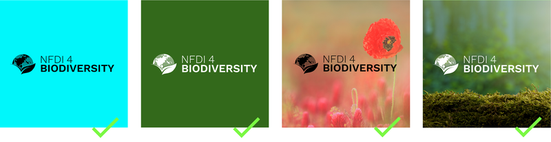
High contrasts make the icon and lettering stand out well and ensure good legibility.
Negative examples:
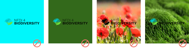
Low contrasts and uneven backgrounds make for poor legibility.
Project Colours
Project Colours
Nine project colours are available for a uniform and characteristic design. In order to achieve a high recognition value of our project materials, we ask you to use these colours first and foremost. If additional colours are required, for example for infographics, posters, etc., other suitable colours can be added at your own discretion. For further information on use, please see "Note on use".
Colour codes
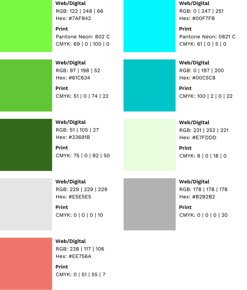
Notes on use
The bright green and blue tone (first row) is particularly suitable for accentuating smaller elements and areas; in infographics or on presentation slides, for example, smaller boxes, arrows, bullet points, etc.
For larger areas, we recommend the more muted colours below. In general, make sure there is a good contrast. Lettering should always be in black or white.
It has also been shown that the bright tones in PowerPoint presentations shown via a beamer can appear pale. We therefore recommend switching to the darker shades (row two).
Project font Work Sans
Our project font is called Work Sans and is used, among other things, in our logo, on the website and in the slide template. The use of this font for the creation of materials such as posters is strongly recommended for the sake of a harmonious overall impression.
It can be downloaded from www.fonts.google.com/Work+Sans.
Es kann vorkommen, dass Work Sans nicht korrekt angezeigt wird. Sollte das der Fall sein, kann auf die ähnlichen Ersatzschriften Helvetica und Arial ausgewichen werden.
Language
Spelling and pronunciation of NFDI4Biodiversity
Das Konsortium schreibt sich wie folgt: NFDI4Biodiversity. The NFDI is pronounced in German, the 4 and the Biodiversity in English.
Gender-sensitive Language
Inclusive language must be used to address all genders. For the German language, we make some specifications for this.
In some cases, the gender-neutral present participle can be used, in which the corresponding verb becomes a noun in the progressive form (gerund). The term 'Teilnehmerinnen und Teilnehmer' thus become 'Teilnehmende'. Further examples: Lehrende, Studierende, Mitarbeitende.
In addition, we use the gender colon to address female, male and diverse readers. The gender colon is placed after a masculine term or the root of the word and before the feminine ending. For example, the term 'Biologe' becomes 'Biolog:in'. The colon, like the gender asterisk, belongs to the so-called gender signs: A typographical sign as an addition to a word indicates the gender diversity of a person's name.
Why the colons and not the asterisk? Read-aloud tools, as they are integrated into many browsers today as part of the operating aids, can read the colon better (a short pause is left between the first part of the word and the ending).